I'm currently finishing off the
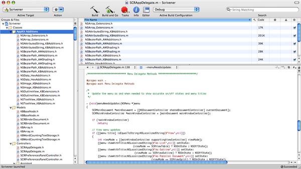
Literature & Latte website: getting the new forum up and running, gathering together free downloadable stuff (a couple of trivial programs and some classes for Cocoa programmers), putting together a links page, and of course getting the Scrivener page ready (so that I'm ready to hit the ground running when it is actually finished). Whilst I've been doing this, I've also been mocking up the new interface for Scrivener. I had it sketched out on paper, but I wanted to see what it would look like in practice: there's no point in forging ahead unless it looks like it's going to work. (Pretty much all of the code for Scrivener has already been written - the hard part now is just putting it all back together so that it works well in the new interface, optimising it and ironing out any glaring bugs - a couple of months' work at least.)
This is really the third iteration of Scrivener's interface; the fourth, if you count Hemingway, my prototype for Scrivener. Getting the interface right has probably been the single-most difficult aspect of designing Scrivener - after all, a good interface is crucial, and can make or break an application. These have been my objectives in designing the interface:
1. It has to be intuitive. If you need to glance at a manual before you start writing, something is wrong.
2. It has to allow fluid movement between outlining, composing and editing.
3. Every document should be linked with a synopsis, to facilitate easy outlining.
4. You should be able to get everything out of the way if you want to so that you are left with just you and your text.
5. It should provide for easy cross-referencing, both with other text documents and media files used for research.
6. You should be able to dictate the way you want to work (I hate software that tries to force you into a particular work flow), so it has to be flexible.
7. There should be no bloat. If it's not essential to everyday writing, it doesn't belong in the application.
The hardest part of designing a really good, intuitive interface has been simply this: there are currently no programs out there quite like Scrivener to refer to for inspiration. Now of course, I'm not claiming that there is nothing else out there that has the same purpose as Scrivener (there is plenty); just that nothing else quite works in the same way. For a start, no other program I know allows you to keep a synopsis for each document that can be viewed in a separate overview as an outline (which was Scrivener's original
raison d'etre). And, whilst there are a few index card/corkboard emulations out there, all of the programs that do provide a corkboard provide it as their main feature, not as something integrated with project management, text editing or outlining (excepting perhaps
Final Draft). This gives rise to numerous implementation problems: exactly when should you see the corkboard? How should you be able to access it? In Scrivener Gold, the corkboard is a separate mode altogether. It's like another program tacked on, which is not good. In the never-released Scrivener 0.3, you would see the corkboard when you clicked on a group in the binder - but this was problematic too, because groups could also hold text, so you needed a switch to toggle between viewing the corkboard and the text for group items. Hardly elegant. Now I have come up with another solution: the corkboard (and outliner mode, for that matter) works a little like "Bookmarks" in Camino. Click the corkboard in the toolbar and the current document turns into a corkboard, displaying the children of the currently selected document (outlining will be a little more fluid in the new version - like groups, text items in the binder can also have children, for instance). Click it again, and the corkboard disappears.
And what about all the problems involved in having a split view that lets you look at your research in one view whilst looking at your text in another? To my knowledge, no other program has that feature (yet). I would be surprised if I'm not wrong, though - there
must be. It's such an obvious idea. I looked to DevonThink for ideas, but as good as DevonThink is for storing lots of different document types, it only lets you look at one at a time in any one window.
Hence the many revisions and iterations of the Scrivener interface. I've finally hit on one I think really draws everything together in a unified, intuitive manner, though. So before I present you with a mock-up of the new interface, humour me whilst I blather a little about some of the other interfaces that nearly made the grade.
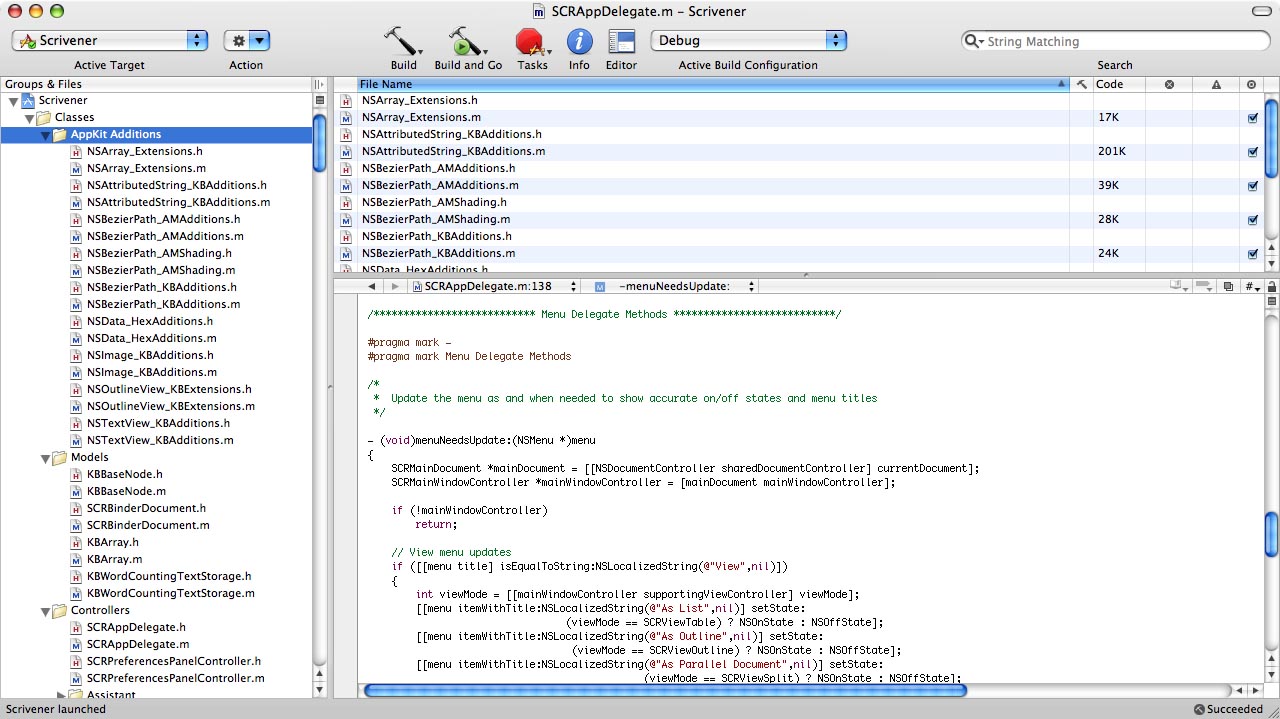
Firstly, I should acknowledge some of the main influences on the Scrivener interface. The biggest influence at first, I think it's fair to say, was Xcode (which I believe also had an influence on various other apps out there, such as DevonThink):
Xcode's interface is simple and effective: it shows all your files on the left, and you can organise them however you like; on the right, you edit them. It sets a standard for any kind of project manager. The navigation bar in Scrivener is straight out of Xcode.
The next important influence was, of course,
Ulysses:
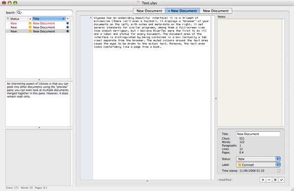
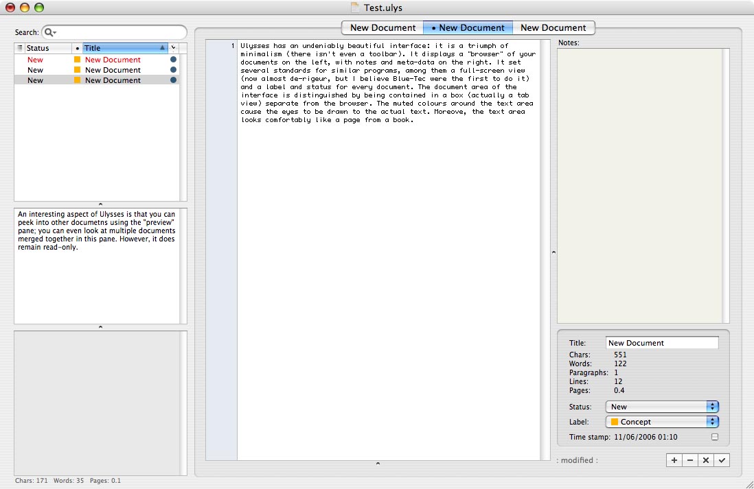
Ulysses has an undeniably beautiful interface: it is a triumph of minimalism (there isn't even a toolbar). It displays a "browser" of your documents on the left, with notes and meta-data on the right. It set several standards for similar programs, among them a full-screen view (now almost
de-rigeur, but I believe Blue-Tec were the first to do it) and a label and status for every document. The document area of the interface is distinguished by being contained in a box (actually a tab view) separate from the browser. The muted colours around the text area cause the eyes to be drawn to the actual text. Moreover, the text area looks comfortably like a page from a book. I fully admit that, whilst redesigning the interface to Scrivener, I have often fired up Ulysses to remind myself of what a well-designed interface looks like.
Another, less obvious, influence has been
MacJournal, the excellent blogging software:

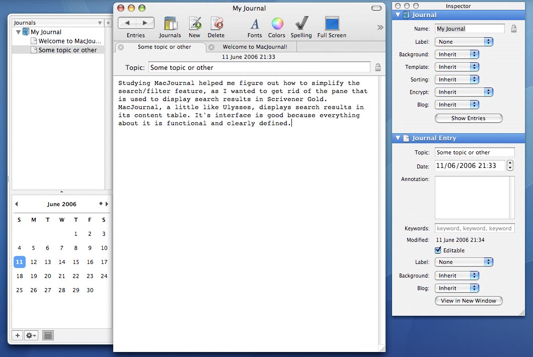
Studying MacJournal helped me figure out how to simplify the search/filter feature, as I wanted to get rid of the pane that is used to display search results in Scrivener Gold. MacJournal, a little like Ulysses, displays search results in its content table. It's interface is good because everything about it is functional and clearly defined. (Incidentally, the way MacJournal handles ctrl-clicks in its contents table is exactly the same as in the next version of Scrivener. I came up with this idea on my own, thought it was brilliantly original, and then, upon downloading MacJournal 4, discovered that Dan Schimpf had beaten me to it.)
An even less obvious influence on the newest interface is the
Camino web browser:
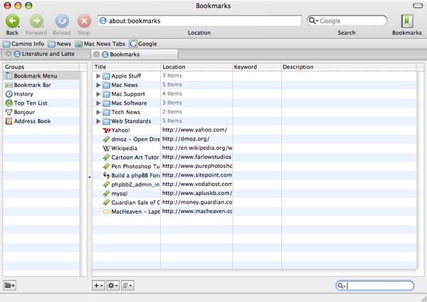
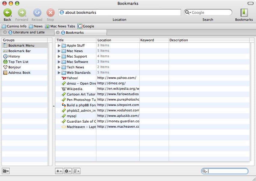
The tab bar and the way that "bookmarks" mode is toggled has been a direct influence on the tabbed interface and the way the corkboard and outliner modes are handled in Scrivener. Camino also looks like a cool, modern Cocoa application (aside from the pinstripes), which is, not unnaturally, what I want for Scrivener.
There are many other interfaces I have looked at and which have had some influence, of course. From
Speed Download I took the rather beautiful gradient outline view (much more subtle than the blue of Mail and the iApps) and the colour-themed toolbar (Scrivener has a purplish-blue colour theme, whereas Speed Download uses an eye-catching red).
Aperture has influenced some of the HUD panels in Scrivener: the new keywords panel looks much like the black, translucent one found in Aperture.
OmniOutliner and
Hog Bay Notebook (now Mori) have had a large influence on the new outliner.
iSale and
Delicious Library helped me rethink and redesign the corkboard view.
Right, onto the Scrivener interfaces (click on the images to read more about each interface, if you haven't lost the will to live already):
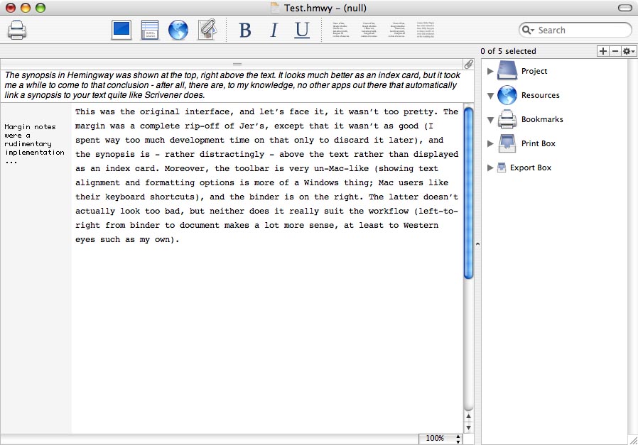
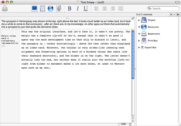
Hemingway (the prototype for Scrivener)
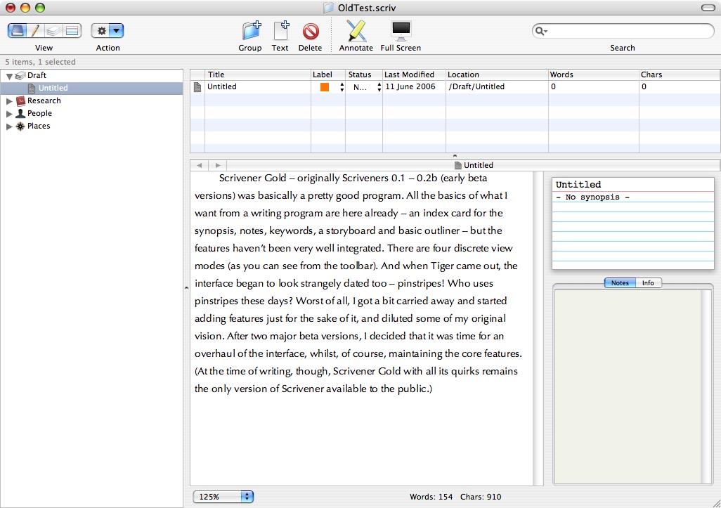
 Scrivener Gold
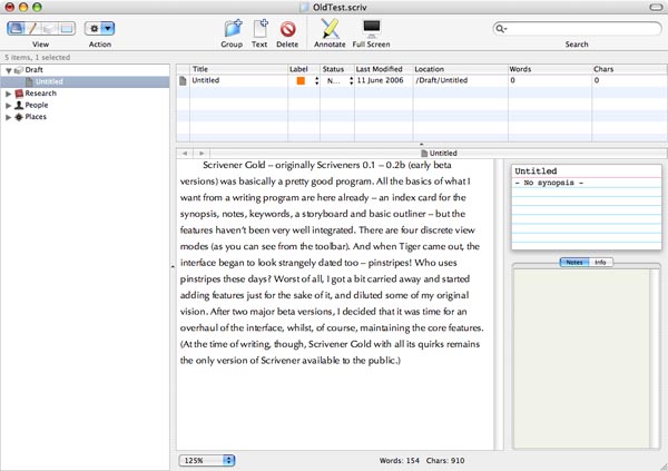
 (Scrivener betas 0.1 - 0.2)
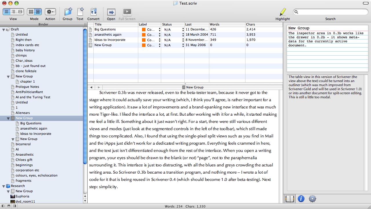
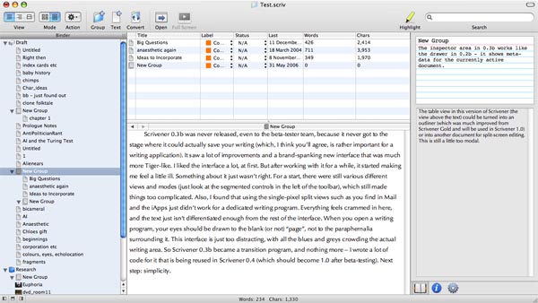
 Scrivener 0.3b
 (never released even to beta-testers)
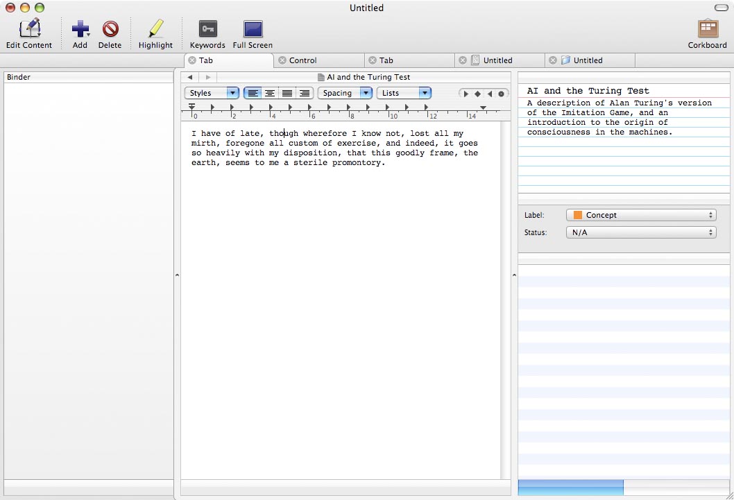
 Scrivener
 (mock up of the new interface)

What you see there is the main view - how it is likely to look for most of the time you are using it. Yeah, I know not everyone is going to like it, but that is unavoidable; beauty is in the eye of... Well, you know. You can hopefully see how the eye is naturally drawn to the central column, where you actually edit and compose your text. It's simple, it separates the binder from the document area without resorting to a drawer (although you will be able to hide the binder and the inspector), and it is fairly obvious that it is a writing tool. Of course, this doesn't show how the corkboard, outliner and split views work - I'll leave that for another time.